These are screen grabs of my front cover to show the gradual construction of my product. I have changed it over time so that it looks more professional.
 |
| Main Headings Done |
From the first draft of my product I had just put on the main sell lines and chose the colours I am going to use. For this I haven't really done much but it shows the basic colours I am going to use and the layout that is going to take form, however I am intending on getting rid of the yellow colour and just using white so it sticks to just the 3 colour palette I originally chose in my initial idea and then people look at one thing at a time, not all at once. I was aiming on this first draft just to show the basic layout and where everything is going to fit.
 |
| Added Barcode and Puff |
Then at the second time I changed it slightly and added a barcode and a puff on the bottom of the page, just so it looks like there is more to the magazine and shows what is included. I started by doing this first instead of the image because I did want some of the main sell lines to go over the model, just like in kerrang! and rolling stones. Yet I still need to add the rest of the sell lines so that it doesn't look so empty on the page and blank.
 |
| Complete without Images |
The third image shows that the product is complete with all the main headings, and sell lines on but the images needed inserting. At the moment it looks slightly empty because there are no images and also I think that the barcode is too big so I am planning on shrinking it a bit so that it's not too large and doesn't look like an actual magazine cover. I like the front cover so far but I am intending to add more to the 'gigs inside' just to fill some of the gaps that have been left.
 |
| With images |
The fourth screen grab shows all the images put on the page but the main image will be changed because there isn't enough pixels and it looks to over-stretched therefore it needed changing. I also have to finish this on photoshop so that the masthead goes behind the model's head and resembles the Kerrang! research I had got previously to make my initial idea work and it is what I had based my product on all along, as they also use red, white and black often for the housestyle and main colours.
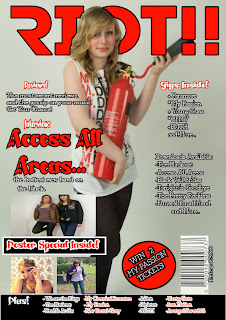 |
| Fully Completed |
The last screen grab shows my completed magazine cover with the three main colours only as the yellow was removed and made the page look too busy. The image also goes with the colour scheme as it has a red fire extinguisher and the model is wearing red, white and black clothing which I thought was more clear and shows the passion of the model, and it fit with my genre and initial idea. I added a circle banner to advertise winning tickets so that it didn't have a large gap and look empty but I think I might change the colours around because I think that the red stands too far off the page, also I am removing the white border around the 'poster special' because it looks strange against the models leg. After making these slight adjustments my product will be complete.
 |
| FINAL |
This is my final product and I think it has been more improved as the images go well together and they don't look too over stretched or busy on the page. I think that I will increase the black text so it is easier to read and also put the 'downloads available' heading in beckasin red the same as all other catergory headings, just so it stands of the page more and shows the content clearly. After this the products will be fully complete.


No comments:
Post a Comment